

By Aleksandra Kaplan, partner at Swan Dive Design Studio
The definition of the restaurant is evolving. Spaces are becoming more creative and efficient as operators opt for more multifunctional models, according to a recent report from the National Restaurant Association report.
This shift away from larger-scale traditional layouts is a natural response to rising costs and the notoriously tight margins of the hospitality industry.
In this landscape, success depends not just on great food and service, but also on getting the absolute most out of your space. That includes both optimizing operations and creating a memorable experience for guests. Fully 75% of diners reported being willing to pay more for a one-of-a-kind experience when they dine out.
In Colorado, a state known for our entrepreneurial spirit, striking the right balance between efficiency and experience is especially critical as nearly 70% of our restaurants are independently owned and operated.
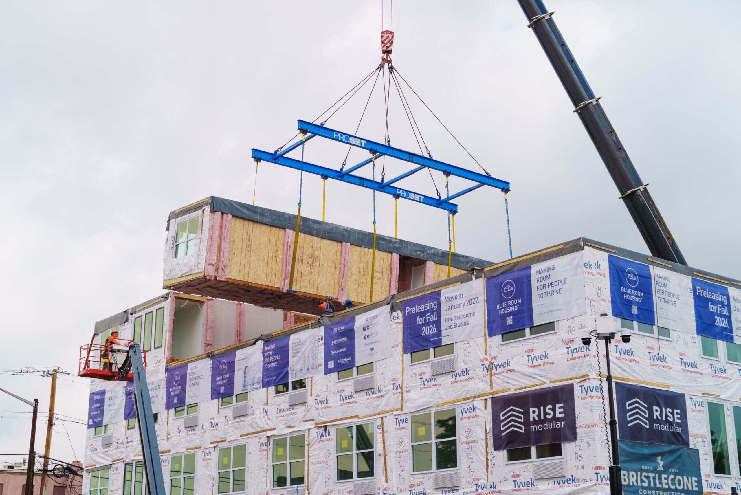
From our experience designing restaurants of all sizes, but especially supporting some hyper-efficient layouts, our interior architecture and design team at Swan Dive has gleaned some lessons in making every inch count when it comes to small restaurant design, from the new Maria Empanada outpost coming soon to Colfax, to Little Owl Coffee LoHi and further afield to Two Twelve in Crested Butte.
With sometimes less than 500 square feet to work with, these projects challenged our team to come up with high-impact, high-functioning designs. Using these experiences in more, we’ve pulled together our top tips and considerations for designing (and wow-ing) in a small space.
Form Must Follow Function
First, the obvious: small spaces don’t allow for neglected or wasted space. Understanding circulation and flow is crucial. Working closely with our clients, we’re asking questions like: How will people enter the space? How will they queue up and where will they wait for food? And, perhaps most importantly, what will they see, hear, touch and experience at each stage of this process? How can we create a seamless experience that also provides moments of surprise, joy, or maybe a glimpse behind the scenes?
While this may seem intuitive and often the owner has specific ideas about how they want the diner experience to flow, this is often the biggest challenge in restaurant design and the most important thing to get right.
Within Little Owl’s third location in LoHi, which comes in at a scant 400 square feet, the mise en place was meticulously considered for maximum efficiency – there is no wasted movement. We positioned the coffee station no more than two steps from the POS system. Every aspect of the process is designed and considered to optimize the execution of their craft – to optimize their kitchen as a tool.
Further West at the new live-fire restaurant concept, Two Twelve in Crested Butte, meeting the owner’s expansive programming goals for the space, including extensive wine space, a bar experience, a chef’s counter and the seat count they needed to make the concept financially viable required space optimization down to precise seat depth. Like a game of Tetris, we identified opportunities to extract the maximum value out of the full volume of the space while maintaining a good flow for their kitchen.
Go Big in Little Ways
Just as we design to optimize efficiency so that no square inch goes to waste, we also design to amplify impact in small spaces. The modest footprint often allows for higher-end materials and the close proximity of diners to the architecture creates opportunities for more immersive, personal experiences.
At Maria Empanada’s newest location at 2730 E. Colfax Ave., bold, higher-end tile instantly sets the mood within the compact 512 square feet of space. Throughout the space, the design pays subtle homage to the art of empanada-making through a conscious focus on the joining of materials. The detailed shelving around the cash wrap, for example, features brass carefully intersecting with wood. A recessed inlay of brass in the countertop draws the eye and further nods to the beauty that comes from combining materials.
Even in the smallest spaces, there is an opportunity for surprise. Within Little Owl, we maintained calming, earthy limestone tones, which only makes the pop of burgundy in the archway – a high-gloss statement moment – that much more impactful.
Design to Grow
These small spaces are often phase one in a restauranteur or hospitality entrepreneur’s plan. They want to grow and they want their customers to come with them and recognize their signature even as they move into larger spaces down the road. So from the smallest concept, we’re always thinking about what a brand’s signature could be. What are those little Easter eggs we could incorporate into future designs that their Day One customers will appreciate and remember?
These design features might be subtle or signature. The bold archways and textured walls at Little Owl will have applicability and carry forward their wabi-sabi design ethos. The massive wine tower with its custom steel and illuminated glass storage at Two Twelve is instantly recognizable and creates a memorable experience that they’ll recognize in another location. With each concept, we try to develop a design language that can scale with the business.
As the trend toward smaller, multifunctional spaces grows, operators can take these principles to heart, using smart design strategies to create memorable dining experiences that keep customers coming back.